
Why Translating Product Descriptions Is Not Enough for Mexico
Many brands do the same thing when they expand into Mexico.
They translate the product title. They rewrite the bullet points. They duplicate the landing page. They may even translate a few review snippets or support messages.
Then they stop.
On paper, the store is localized. In practice, it still does not feel fully prepared for Mexican shoppers.
That gap usually sits in the visuals.
The product page may be in Spanish, but the image callouts still say things like "Waterproof shell," "3-step installation," or "Size guide." The ad creative is still in English. The comparison chart inside the gallery still uses the original US copy. The result is subtle, but shoppers feel it right away: this page was adapted, not truly built for them.
If you sell into Mexico through Shopify, Amazon, Mercado Libre, or paid social, translating descriptions is a good start. It is just not the whole job.
The short answer
If the buying argument lives inside your product images, then descriptions alone will never carry the full localization workload.
That is especially true in Mexico, where many shoppers move fast, shop on mobile, and rely heavily on visual cues to understand:
- what the product does
- why it is better
- whether it fits
- how to use it
- whether the seller feels trustworthy
If those answers still live inside English visuals, the page creates unnecessary friction.
Why this matters more in Mexico than teams expect
Teams sometimes assume that Spanish translation on the page is enough because plenty of Mexican shoppers can recognize some English words. That may be true in a loose sense, but it is the wrong benchmark.
The question is not whether someone can decode the page eventually.
The question is whether the storefront feels easy, local, and convincing in the few seconds where a buying decision is being made.
That is where partial localization starts to hurt:
- the product page feels patched together
- the ad promises one thing, but the gallery explains it in another language
- size and usage details become harder to scan on mobile
- the visual polish drops compared with local or better-prepared competitors
Most of the time, shoppers do not say, "Your image localization is incomplete." They just hesitate, bounce, or buy from a listing that feels more effortless.
The real sales story is often inside the images
For many e-commerce categories, the description is not the first thing doing the work. The images are.
Think about the kinds of visuals sellers already use:
- feature callout graphics
- before-and-after panels
- ingredient or material highlights
- comparison charts
- dimension guides
- size charts
- how-to-use or how-to-install panels
- campaign banners and promo graphics
Those are not decorative elements. They are part of the sales argument.
So when a page is translated into Spanish but the gallery still contains English messaging, the localization is only half complete.
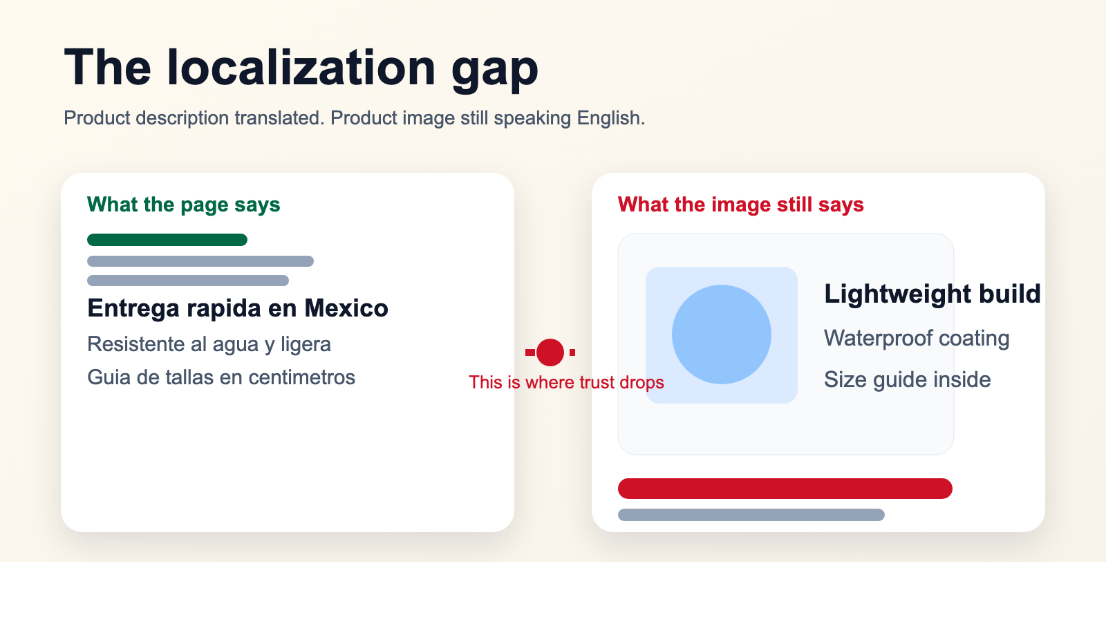 Caption: This is the gap many teams miss: the page says one thing, but the product images still tell the story in English.
What should change first for Mexico
The good news is that you do not need to rebuild your entire asset library before launch.
The better move is to start with the visuals that most directly influence understanding and confidence.
1. Feature graphics
If your product sells through short benefit claims, localize those images first.
This usually includes:
- benefit headlines
- proof points
- material or ingredient claims
- quick comparison banners
These are often the first images a shopper uses to decide whether the product is worth a closer look.
2. Size charts and dimension visuals
This matters a lot for apparel, footwear, home goods, baby products, and accessories.
If shoppers need to pause and decode labels, units, or fit notes, the page loses momentum.
3. Usage and installation visuals
For electronics accessories, beauty, personal care, fitness products, home tools, and supplements, the "how it works" panels are often more important than the long description.
4. Marketplace and ad creatives
If you are driving traffic from paid ads or marketplace placements, the localization work cannot stop at the PDP. If the ad is still visually English-first, the funnel already starts with friction.
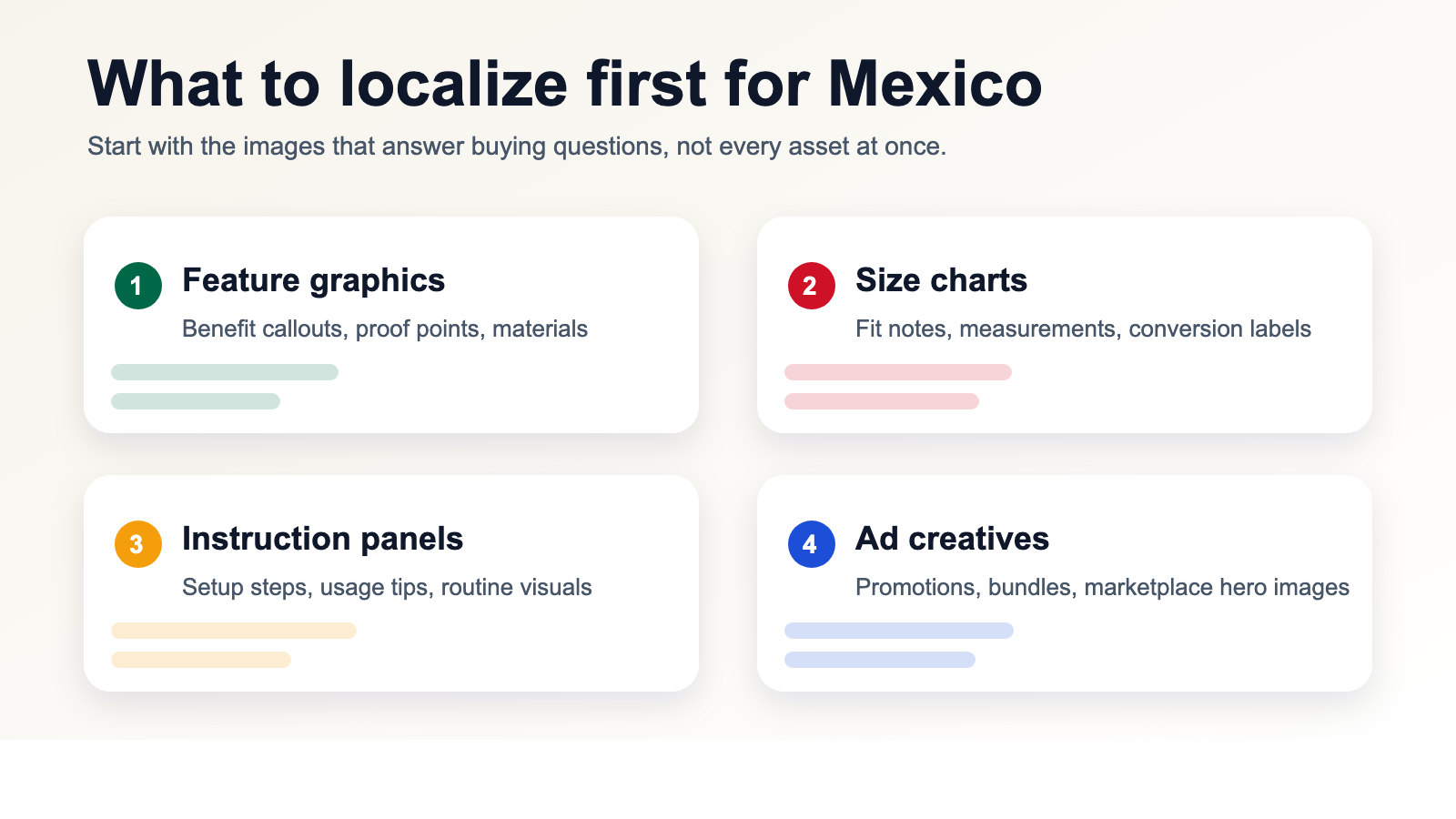 Caption: You do not need to localize everything at once. Start with the assets that answer the buyer's biggest questions.
Why this is not just a translation problem
A lot of teams treat visual localization like a language task. In reality, it is a production task with language inside it.
You are not only translating words. You are also trying to preserve:
- readability
- hierarchy
- visual balance
- background quality
- mobile clarity
- consistent terminology
That is where manual workflows usually begin to slow down.
Someone has to find the original design file. Someone else realizes the PSD is outdated. Another person manually removes the old text, repositions the new text, and exports a fresh version. Repeat that across ten images, fifty SKUs, and three campaigns, and you suddenly have a content operations problem instead of a translation task.
The mistakes that make a Mexico launch feel unfinished
There are a few failure patterns that show up again and again.
Literal translation inside visual copy
Page copy can sometimes survive a more formal translation. Product-image copy usually cannot. It has to feel quick, natural, and shopper-friendly.
English left in the "important" images
Even if some minor images remain untouched for a while, leaving English inside the core feature or sizing images creates a very visible mismatch.
Rough text removal
If the old text is blurred out badly or replaced with a flat patch, the image immediately looks edited. That hurts trust faster than most teams expect.
Inconsistent terminology
One image says one thing, the next uses a different phrase, and the whole gallery starts to feel assembled instead of designed.
Treating every asset with the same priority
Not every image deserves the same attention on day one. What matters first is the content that directly answers purchase objections.
A cleaner workflow for localizing existing assets
The fastest teams are usually not the ones redesigning everything from scratch.
They are the ones who treat strong English assets as a base and adapt the language layer efficiently.
The workflow is usually much simpler than people expect:
- Choose the images that actually drive buying decisions.
- Remove the original text cleanly.
- Replace it with natural Spanish for Mexico.
- Review spacing and readability on mobile.
- Reuse the same terminology across the rest of the catalog.
That lets you keep the visual logic that already works while making the store feel more local.
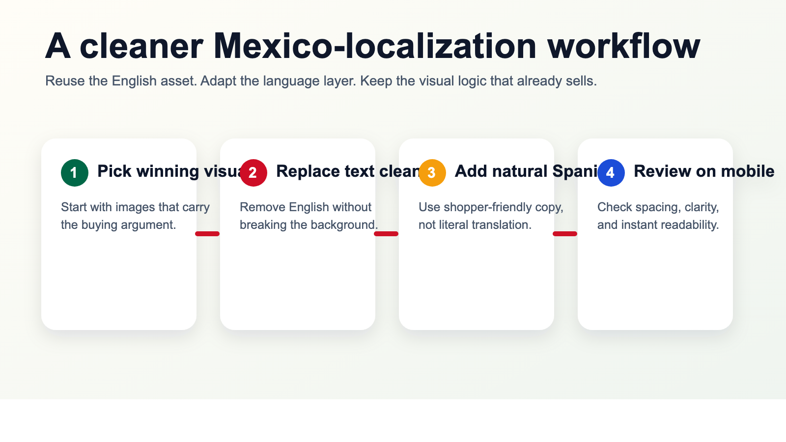 Caption: Reuse the creative that already sells. Adapt the language layer instead of rebuilding every image from zero.
Where sellers usually see the payoff
This kind of work tends to matter most when:
You are expanding an existing US catalog into Mexico
The product already has validated creative. The issue is not strategy. It is adaptation speed.
You sell in image-heavy categories
Beauty, apparel, home, accessories, supplements, and consumer gadgets all rely heavily on visual explanation.
You are listing across multiple channels
If the same SKU appears on Shopify, Amazon, Mercado Libre, and paid social, image localization becomes one of the few ways to keep the presentation consistent without multiplying creative work.
You are trying to move faster than manual design cycles allow
Many teams know what needs to be changed. They just do not have the bandwidth to rebuild every image by hand.
Why VOKWA AI fits this stage of expansion
VOKWA AI is useful here because the job is not simply "translate my page." The real task is "help me turn existing visual assets into localized selling assets."
For sellers moving into Mexico, that usually means:
- translating in-image text into natural Spanish
- removing the original English cleanly
- preserving the design and background
- making the result usable across listings, storefronts, and ad creatives
That is where the time savings show up. You do not have to throw away the creative that already works. You just stop leaving the most visible parts of it in the wrong language.
Final thought
If your product descriptions are localized but your images still explain the product in English, your store is sending mixed signals.
The page says, "We sell in Mexico."
The visuals quietly say, "We have not finished preparing."
That is why product-description translation is a necessary step, but not a complete one. The real improvement happens when the product images, charts, instructions, and campaign creatives start speaking to the same shopper in the same language.
That is what makes a launch feel ready instead of almost ready.
If you need a faster way to localize the visual side of your Mexico expansion, VOKWA AI can help you adapt existing product images without rebuilding every design file from scratch.
FAQ
Is translating product descriptions enough for selling in Mexico?
Usually not. If key benefits, size guidance, instructions, or comparison points still live inside English images, the storefront can still feel incomplete to Mexican shoppers.
What should I localize first for Mexico?
Start with feature graphics, size charts, instruction panels, and ad creatives that carry important buying information.
Do I need to redesign every image from scratch?
Not necessarily. In many cases, the better path is to reuse the existing English creative, replace the in-image text cleanly, and keep the layout that already works.
Why do image changes affect conversion so much?
Because shoppers often understand the product through the visuals first. If the image text is harder to read, trust and clarity drop before the description has a chance to help.